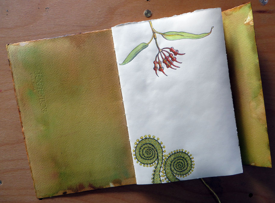
The next stage of the four-way collaboration sees me adding to Karen Bailey’s book. Karen has chosen the theme of patterns in the forest – this delighted me, as it covers two of the things I like best, patterns and the natural world. The first page is a communal one, and Karen had begun it with a drawing of an unfurling fern frond, so for my contribution I chose something that also has strong, distinct shapes and rich colour, a sprig of gum nuts with leaves.
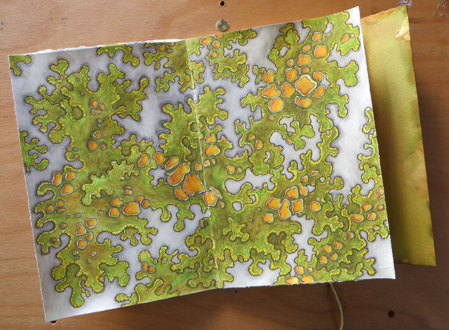
The next double page spread was Karen’s lichen.
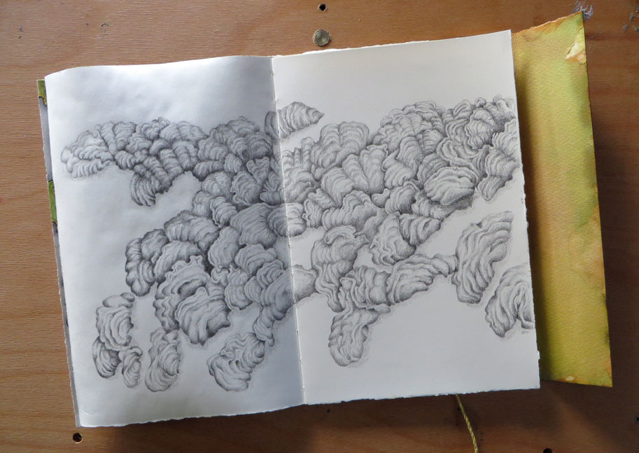
This was followed by my double page spread – I chose an array of fungi for my subject. They were neutral coloured, growing on a dead tree trunk in Kangaroo Island. I decided to depict them in simple graphite, to emphasise the almost abstract shapes, with no distraction of colour. They became reminiscent of coral or clouds – or other objects found in nature.
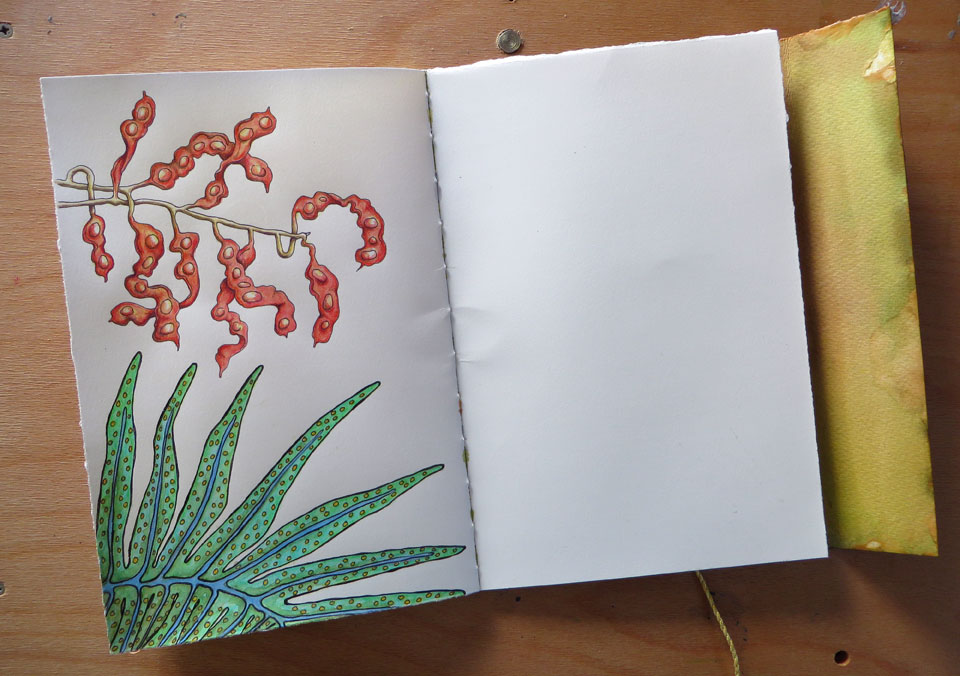
The final page that I contributed to is the last double page spread. Karen had started it with a fern leaf, so I added a twig adorned with bright red seed pods – these I had found in Central Australia, and they made an exuberant contrast to the muted fungi spread.
The book is 24 cm x 16 cm. I used watercolour pencils, coloured pencils, pen and graphite in my contributions.
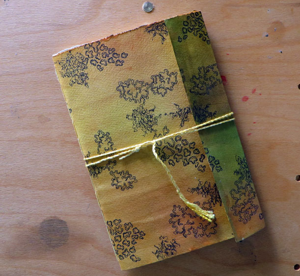
This is the closed book. Next week it will be heading to Gale in Oregon, then on to Cathe in Minnesota. To see work from the other three, go to
http://karenbaileystudio.com/2015/03/28/patterns-in-nature-a-new-artistic-collaboration/
http://sticksstonesnpaperstew.com/2015/04/06/water-sketchbook-collaboration/
https://amaryllislog.wordpress.com/2015/04/11/collaboration/

It is an absolute delight. You didn’t mention the inside front cover – which appears to be purely watercolour washes. The paper’s watermark can clearly be seen. I think that page by itself is beautiful too. Your responses to one another’s work are sensitive and sublime.
LikeLiked by 1 person
Thank you Julie – yes, I think the inside cover is just washes, it’s the same as the cover, but Karen added pen drawing to the outside. Part of the challenge is not simply to respond to the theme, but to make my work cohesive with what has gone before, so I’m glad that seems to be happening!
LikeLike
Julie, I used Dillusion spray dyes on both sides of the cover, which I then covered with matte medium as I realised that the dyes would re-activate with water and did not want them to come off on the drawings. On the outside of the cover I did some little ink patterns of moss and lichen patterns. Karen
LikeLike
What an excellent collaboration, one that must be fun for all of you.
Your inclusion of a uncoiling fern frond reminds me of the many I saw in New Zealand this February:
https://portraitsofwildflowers.wordpress.com/2015/04/08/little-hard-fern-koru/
If you’re not aware, as I wasn’t till then, let me add that New Zealand has giant ferns the size of trees:
https://portraitsofwildflowers.wordpress.com/2015/03/14/ferns-as-tall-as-trees/
LikeLike
Thank Steve, yes this project has given me enormous pleasure, and there are still two more to go! Aren’t those ferns great – of course New Zealand is THE place for ferns. It would be amazing to get in amongst them.
LikeLiked by 1 person
It took me decades to finally get there. I hope it won’t be that long for you.
LikeLiked by 1 person
Just wonderful Anna, it looks great! I really like how you have added to my drawings and your spread answers the brief and give your delicate twist to the subject. This is such a rewarding and exciting thing to do! I will post mine tomorrow evening. Karen
LikeLike
Thanks Karen – I am very relieved you like the look of it! I did enjoy doing it, and making the very different choices of treatment. The graphite image doesn’t photograph terribly well, so hopefully it will look richer in real life! I keep tweaking it, but will have to eventually just let go. It will go to Gale tomorrow.
LikeLiked by 1 person
I like the contrast between the bright first pages and the muted graphite sketch, which not only provides contrast in the book but also reminds me of the bright and dark places in a forest. Looking forward to your next contribution and watching the books develop.
LikeLike
Oh thank you Anne – that is such a nice thought about the contrast between the bright and dark places. Maybe subconsciously this was something I was looking for, I knew I wanted to work in monotone, so maybe this is why!
LikeLike
very good ideas and beautiful paintings
LikeLike
Thank you!
LikeLiked by 1 person
Brilliant idea Anna, love it
LikeLike
Thank you MM, lovely to hear from you!
LikeLiked by 1 person
Wow, WOW! This book is amazing! I’m so excited to see how its coming together! I love the harmony between artists and the richness of each image, so incredibly beautiful. It all hangs together so nicely but still their is individuality in the approach. Really stunning!
LikeLike
Oh thank you Cathe! I am SO pleased that it resonates with you. I know you will add more layers of meaning when it eventually comes to you!
LikeLike
Excellent work by you both Anna ! I love the graphite rendering of fungus … some of the shapes reminding me a little of a collection of oyster shells I saw washed up on a Normandy beach last year . How beautifully the mix of drawing materials work together .
LikeLike
Thanks Poppy – I can see exactly what you mean about the oyster shells. Something I was hoping for in this drawing was to make connections with other natural objects, I’m so glad that is what you see!
LikeLike
This book is extraordinarily beautiful. I too, love patterns and I am so taken with how you are all working together (and internationally) on this.
LikeLike
Thanks Nancy – it has been an exciting and satisfying journey, with further still to go!
LikeLike
Wow, Anna! What an amazing thing you have going here with the books! This one is lovely! The fungi reminds me of brains! No offense. That’s just what I thought of when I saw it! 🙂
LikeLike
Patsy, I am very happy that the drawing reminds you of brains! I had hoped people would see all sorts of different things in it.
LikeLike
Awesome! Your drawing is so intricate and wonderful to explore, Anna!
LikeLiked by 1 person
These are just beautiful Anna! I love the depth you get in your graphite work, simply stunning.
LikeLike
Thanks Kylie – I do love getting lost in graphite drawing, I eventually just had to stop and let it go!
LikeLike
I know! I’m the same, there is something so gentle about graphite, but also dramatic. Its really lovely isn’t it? It can get tricky sometimes knowing when to step away from the paper! Your drawing is fantastic – you can feel the rhythm in the drawing.
LikeLike
There is a lot of power in graphite, and such a range of tones and textures one can get. So glad you like this one, I did struggle a bit with it!
LikeLike
These collaborations are all just amazing, I’ve been catching up reading about them all. I’m so enjoying being able to continue stories and adding to the previous works. I posted off the second book yesterday, so am hoping you’ll receive it shortly. I look forward to the next one! 😀
LikeLike
The collaborations have been really eye-opening, each one so different!
LikeLike
An exciting installment! Looking forward to more!
LikeLike
I received the next one today – now to start planning!
LikeLike
What a great idea! Do you normally live in Perth?
LikeLike
No, I am from Sydney. I enjoyed working in this book too.
LikeLiked by 1 person